Front Cover

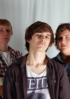
 I didn't really need to do anything to this photo. I was pretty happy with it after I had taken it. I have changed the models from my rough cut slightly and gone back to my inital idea of 3 male models. This seems to work better for the genre of my magazine. I simply cut the top of this photo off as it showed the top of the white screen. I also used the healing tool a little on my models as they had a couple of blemishes that were visable. When I put the photo on my front cover all I had to do with adjust the size of it so it fitted the page.
Contents Page
Picture 01
Picture 02
Picture 03

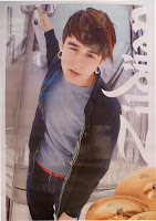
 This photo is I re-sized to fit the space that was designed for this photo. However it does look a little stretched width wise however this is the actual width of the photo. The only re-sizing I did was on the height of the image. I infact made it smaller which could make the width of the image look a little unatural.
Picture 04
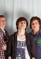
 This is the last photo on my contents page and is of my feature band. I edited this photo by first cropping of the top of the picture as it showed the seam in the sheet. I then used the spot healing tool to edited some of the blemishes on my models that could be seen. Nothing else had to be done to this photo as I liked it from when I took it to seeing it on the computer screen on my contents page.
Double Page Spread

 This photo was one of the ones I took a few days before my deadline. The photos I took that day I really liked because my models actually looked like a band. Therefore the wasnt much I had to edit. Like the rest of the photos I took that day, I had to crop the top of the image off to get rid of the seams that could be seen on the sheet. I then re-sized the image to fit the space I had given this photo on my double page spread. I used the healing tool to get rid of the blemishes on my models faces as this was a more close up image than the one I used in my rough cut and I didnt really want spots and freckles to be seen as I am trying to make my magazine look professional.


